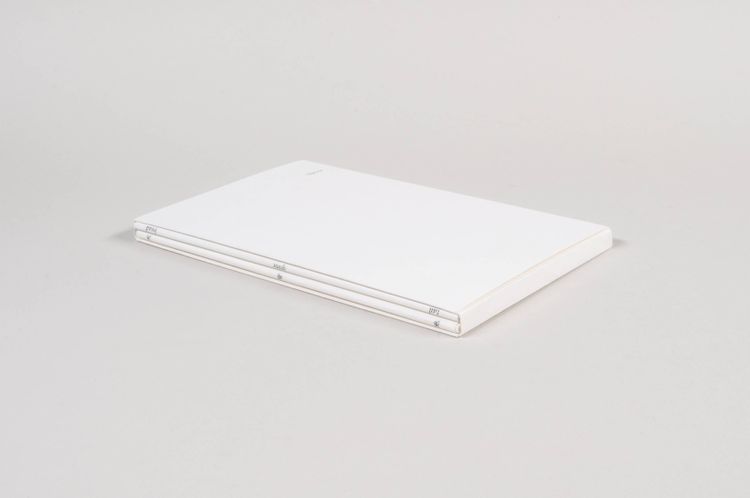
Rahel Zoller’s Title, consisting of three different editions, “is an experimental exploration and illustration of the rules of book design” (Title by Author, vi), thus categorizing it in the genre of self-referential bookworks, to which one could also count Johanna Drucker’s Diagrammatic Writing (2014) and Roberto Arista and Amato Luigi’s Volume (2014), which were created at about the same time. The best-known precursor is probably George Brecht’s BOOK (1972), which also takes itself as subject and virtually guides the readers through the book, showing, naming, and explaining the book elements that the reader encounters. These books are thus at once a tautological description of the same book that the reader is reading as well as a kind of model of a book that—both ostentatiously and didactically—contains established rules and unwritten laws that must be observed when producing, designing, and reading a book.
The 2011 first edition once available on Blurb, back then still circulating under the subtitle “Skeleton Book,” names all conceivable elements and design rules of a book page by page. On the first five pages alone, these are: flyleaf, blank page, prelims, left page/verso, right page/recto, gutter, golden section, half-title, frontispiece, roman numerals, and title page. The next pages then display the main body of the text, whose typographic structure is then schematically reproduced with black lines, reminiscent of Man Ray’s visual Poem (1924) and Marcel Broodthaers’s Un Coup de dés jamais n’abolira le hasard (image) (1969).
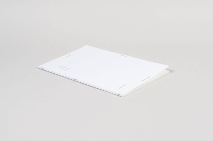
A second, modified edition with a new ISBN was produced in 2017. It was only available from the artist herself, as she now packed the print-on-demand “raw print” in a dust jacket for “refinement” and included an insert with details of the month and year of printing in order to document the changes in paper stock and printing quality over the years, inherent in the print-on-demand process. Each printed copy is thus a record of a moment in time.
In addition, Zoller has made a few minor adjustments to the design and conception of this edition. For example, the author, title, and publisher information on the front cover is repositioned and some terms are exchanged (“front matter” becomes “prelims”). Some minor inconsistencies are amended, such as when the frontispiece is now displayed as a black block, by analogy with the black lines of text, or when “A Book” is corrected to “Title” in order to preserve the self-referentiality of the title page and to let the information really be a placeholder rather than an actual, functioning title. Zoller has accounted for some of these oversights in A Catalogue of Mistakes by Rahel Zoller 2011–2021, distinguishing between unfortunate, inexplicable, hidden, fortuitous, aesthetic, recurrent, and other mistakes. According to this report, the misspelling in the introductory note, which runs through the various editions, is a deliberate one, namely “ironic mistake”: “[This book does not aim to be complet [sic] but constitutes an exploration and illustration of the rules of book design. It can therefore be seen as a kind of skeleton book.]”
The imprint of this second edition contains a note about the update made, but still features the same ISBN, while on the back cover, hidden by the dust jacket, a different ISBN is indicated.
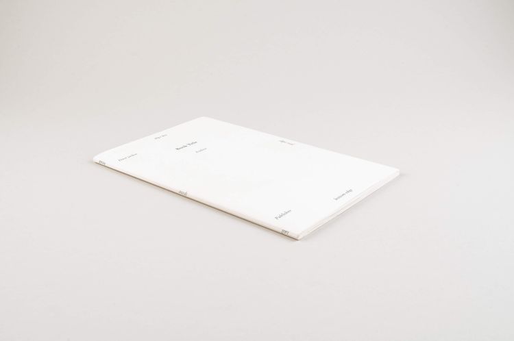
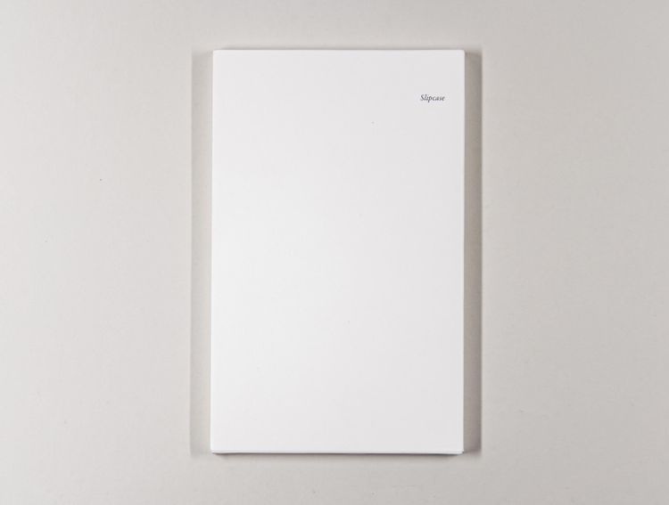
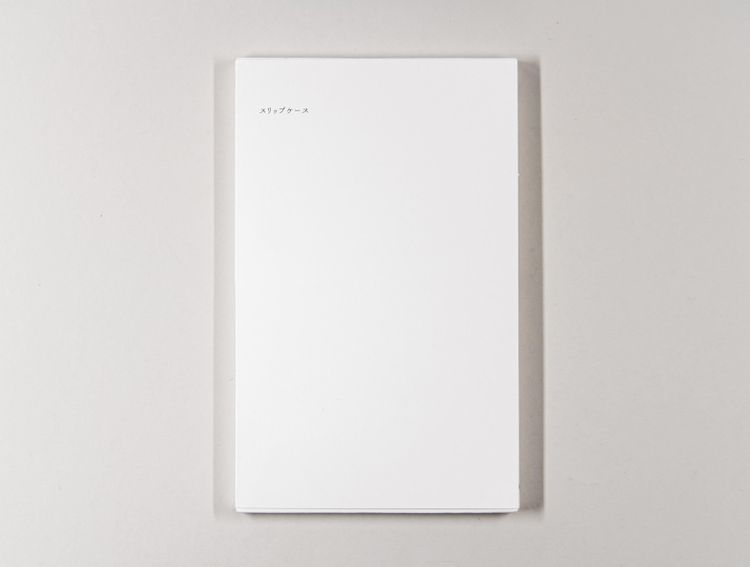
Finally, in 2020, a third edition Title / タイトル by Author / 著者 was produced together with Asami Murakami, for which the second edition was once again revised in such a way that the self-reference is taken to the extreme and one can now literally speak of a “skeleton book”: For now, the entire book truly consists only of placeholders for the individual elements of the book: even the title page and imprint do without mention of actual authorship, publication date, ISBN, etc. The only information given in the book that actually refers to the outside world and allows this book object to be assigned to an author and a publisher is the ISBN on the back cover.
In addition, the third edition pairs the English-language edition with a translation into Japanese, both offered only together in a slipcase. This is not a literal translation, but a conceptual translation into the language of Japanese book culture with its opposite flipping of the pages and vertical text flow, resulting in an intercultural dialogue and encouraging comparative observation: “When naming the top and the bottom of a book in Japan the top is called: 天 sky or heaven and the bottom 地 ground or earth whereas in Western publishing, the top is called head and the bottom tail: this originates from the animal skin a book was bound in historically” (artist’s website). The set is printed and distributed in an edition of 200 copies, half in each of the two countries.
