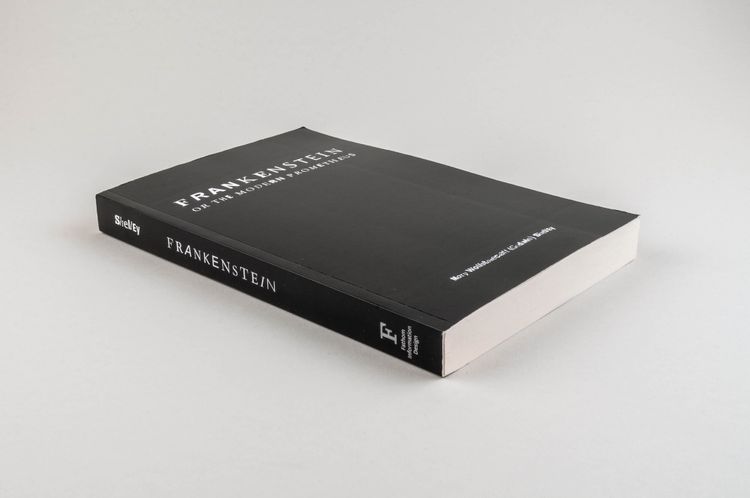
On the outside, this book looks like a normal edition of Mary Wollstonecraft Shelley’s Frankenstein. Only a small note on the back cover refers to the underlying project Frankenfont by Fathom Information Design. Ben Fry’s name is not mentioned anywhere. The following additional information can only be found on his website:
“Frankenfont is an edition of Mary Shelley’s Frankenstein laid out using characters and glyphs from PDF documents obtained through internet searches. The incomplete fonts found in the PDFs were reassembled into the text of Frankenstein based on their frequency of use. The most common characters are employed at the beginning of the book, and the text devolves into less common, more grotesque shapes and forms toward the end.
The beginning of the book is comprised largely of Arial, Helvetica, and the occasional Times New Roman. As you might expect, these are by far the most common fonts used in documents. By page 46 and 47, things have progressed to a lot of Arial Bold and Times Italic. In the 200s, commonly used script fonts, as well as much more obscure faces are beginning to appear. As we reach the end, the book has devolved significantly: non-Roman fonts, highly specialized typefaces, and even pictogram fonts abound.
Process. For each of the 5,483 unique words in the book, we ran a search (using the Yahoo! Search API) that was filtered just to PDF files. We downloaded the top 10 to 15 hits for each word, producing 64,076 PDF files (some were no longer available, others were duplicates). Inside these PDFs were 347,565 subsetted fonts. From these fonts, 55,382 unique glyph shapes were used to fill the 342,889 individual letters found in Shelley’s Frankenstein text.
PDF Fonts. This project started because of a fascination with the way that PDF files contain incomplete versions of fonts. The shape data is high enough quality to reproduce the original document, however only the necessary characters (and little of the font’s ‘metrics’ that are used for proper typographic layout) are included in the PDF. This prevents others from extracting the fonts to be used for practical purposes, but creates an opportunity for a curious Victor Frankenstein who wants to use these incomplete pieces to create something entirely different” (Ben Fry, “The Frankenfont project,” website).
All profits were donated. Another Fathom project (available on Blurb) is On the Origin of Species: The Preservation of Favoured Traces (2015), a visualization of the textual changes in Charles Darwin’s famous theory of evolution, on which he worked for several years and which has therefore undergone several modified editions.
